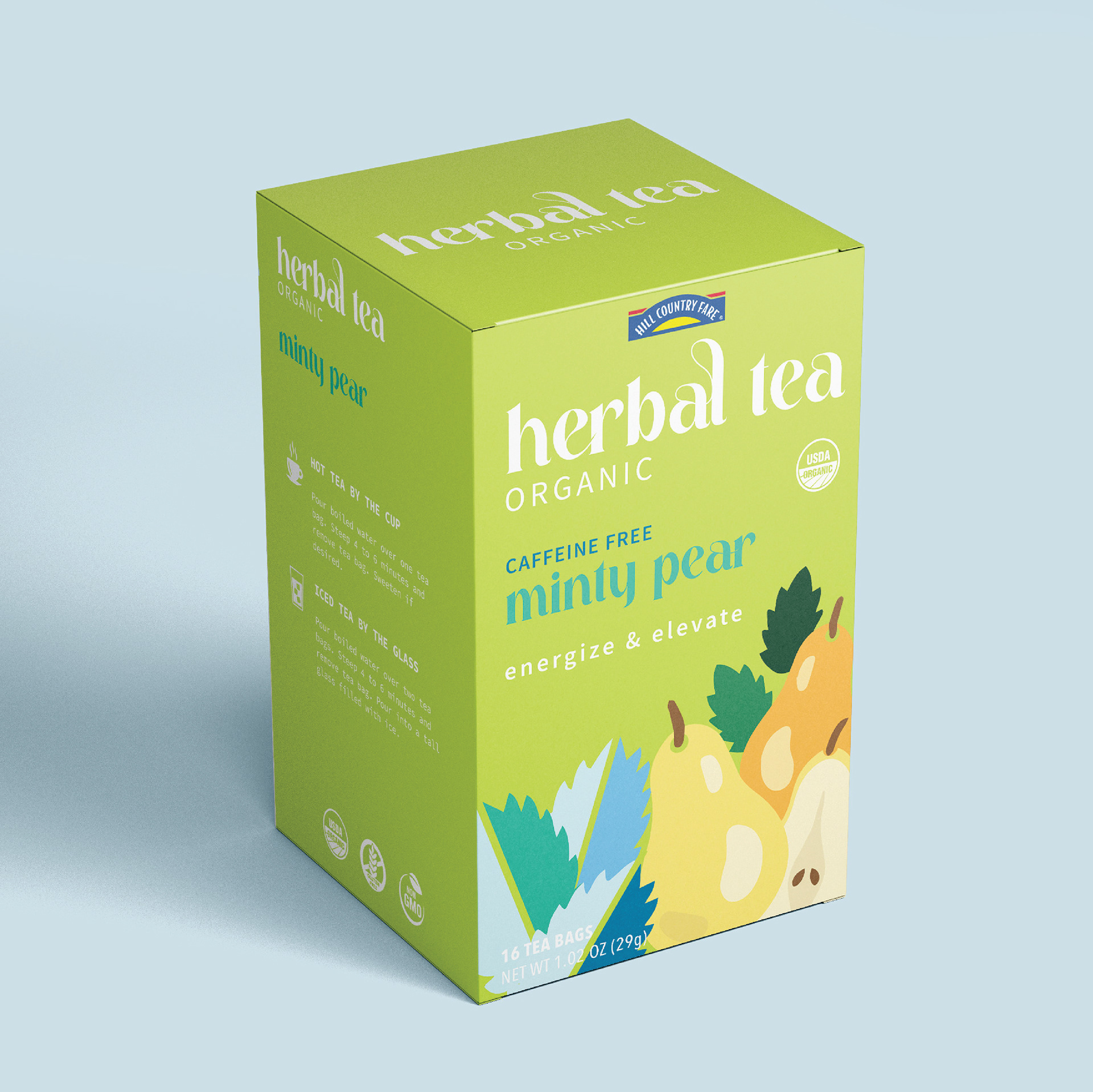
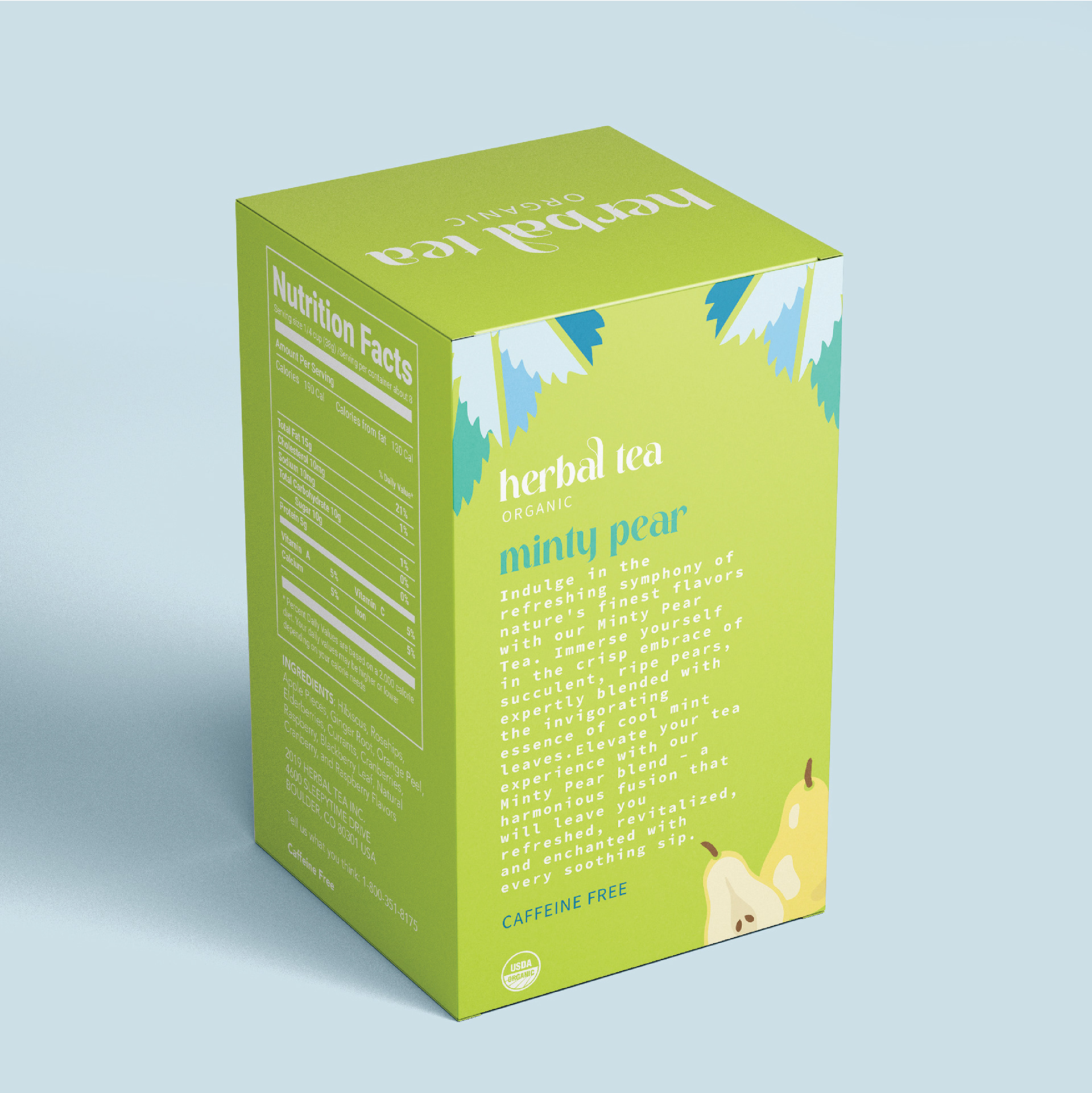
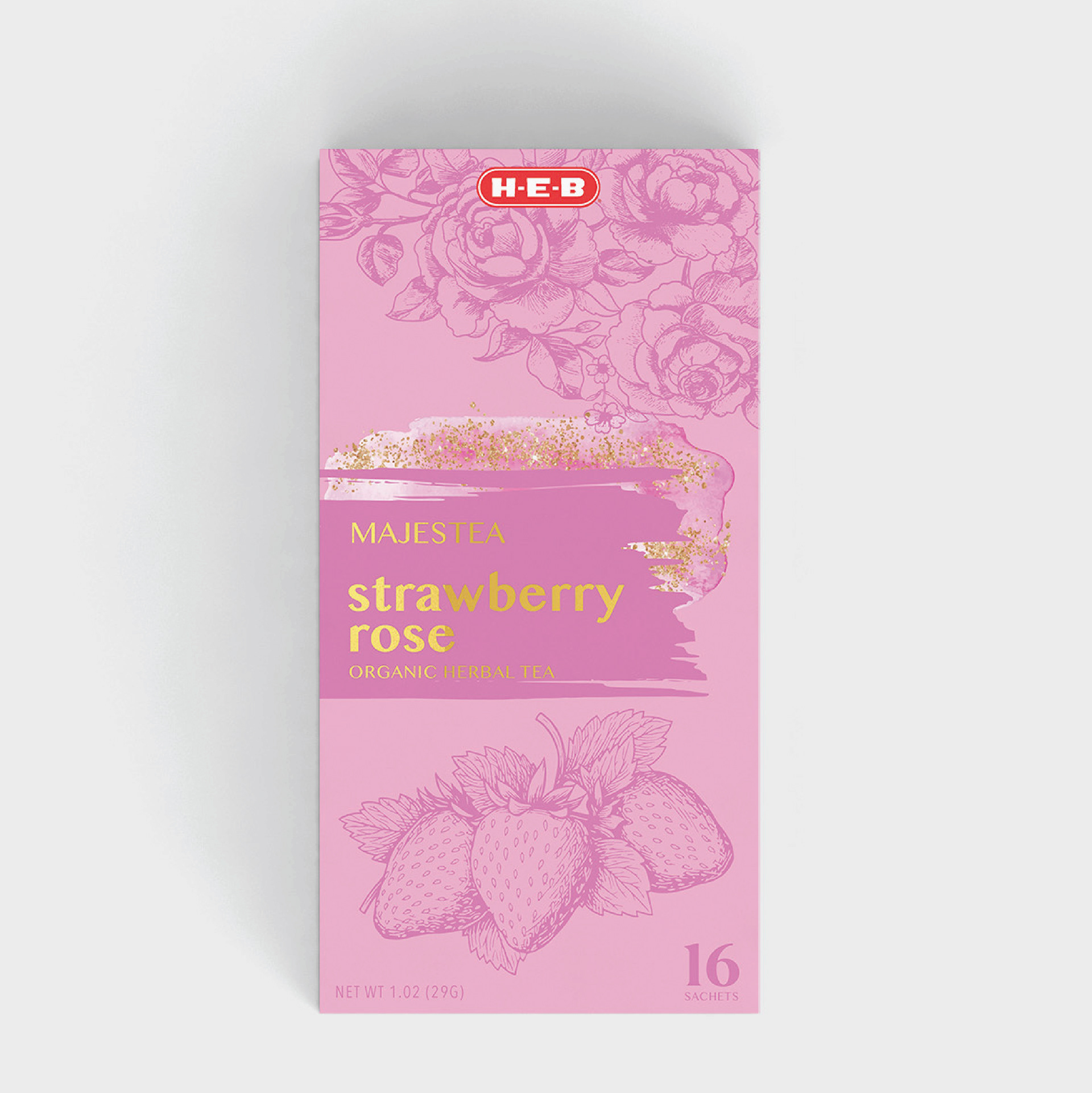

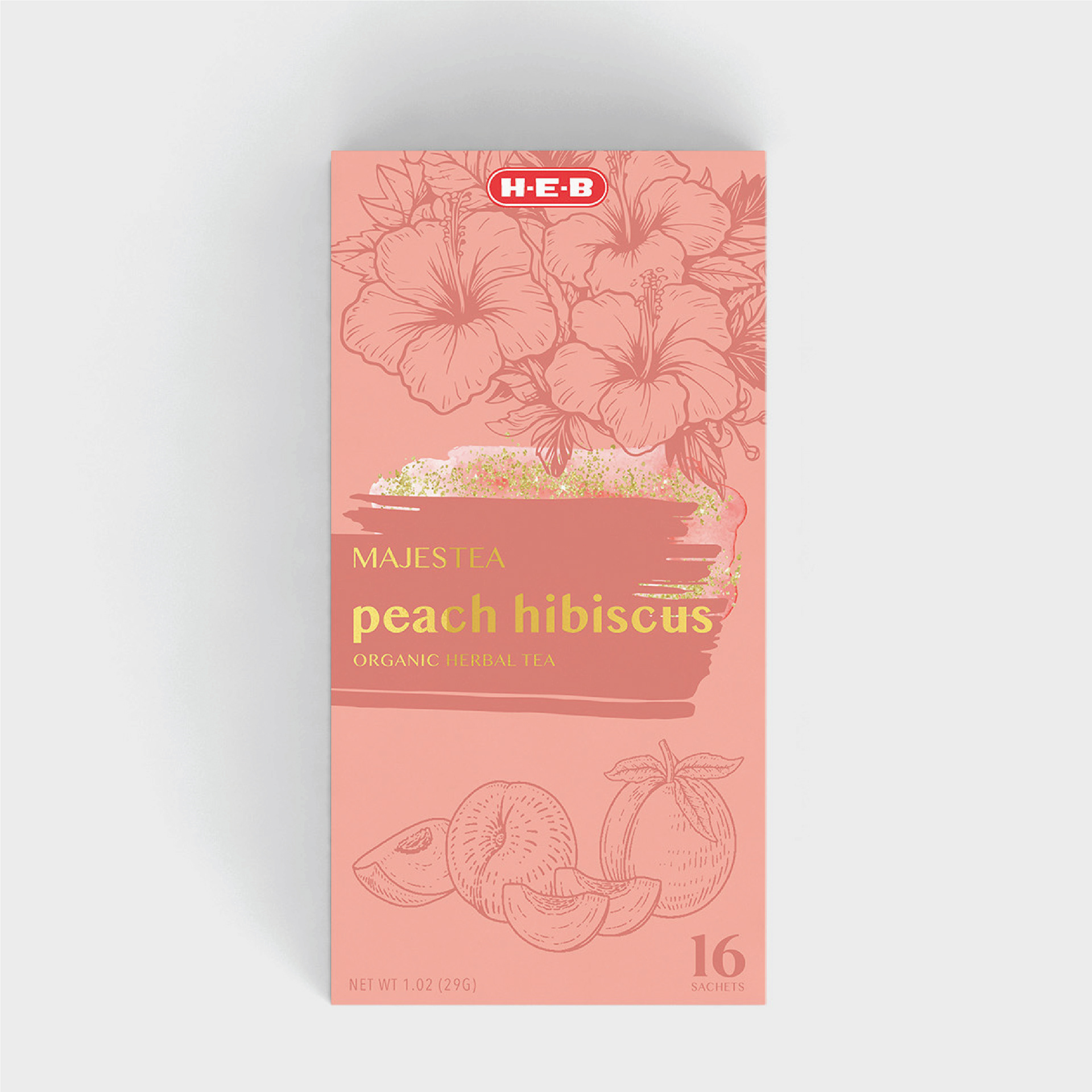
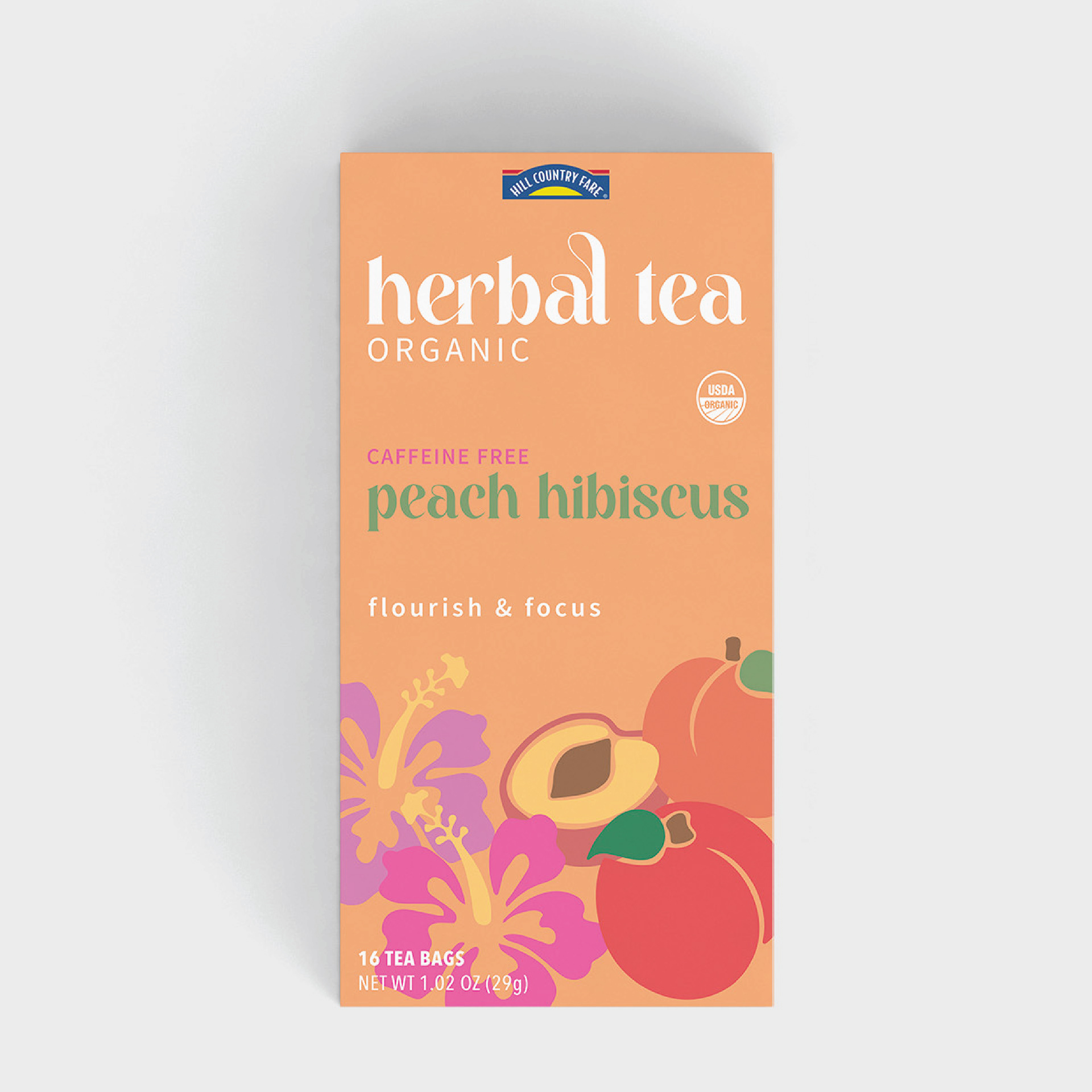
This packaging project aimed to distinguish H-E-B’s premium line from Hill Country Fare’s mid-tier products. I chose tea and designed three distinct flavors. For H-E-B, I used intricate illustrations and gold foil for a luxurious look, while Hill Country Fare featured clean, simple visuals for a more approachable feel. Each design highlights flavor and maintains broad consumer appeal.